Arithmetic
Additive Identity
Arithmetic Progression
Associative Property
Averages
Brackets
Closure Property
Commutative Property
Conversion of Measurement Units
Cube Root
Decimal
Distributivity of Multiplication over Addition
Divisibility Principles
Equality
Exponents
Factors
Fractions
Fundamental Operations
H.C.F / G.C.D
Integers
L.C.M
Multiples
Multiplicative Identity
Multiplicative Inverse
Numbers
Percentages
Profit and Loss
Ratio and Proportion
Simple Interest
Square Root
Unitary Method
Algebra
Cartesian System
Order Relation
Polynomials
Probability
Standard Identities & their applications
Transpose
Geometry
Basic Geometrical Terms
Circle
Curves
Angles
Define Line, Line Segment and Rays
Non-Collinear Points
Parallelogram
Rectangle
Rhombus
Square
Three dimensional object
Trapezium
Triangle
Quadrilateral
Trigonometry
Trigonometry Ratios
Data-Handling
Arithmetic Mean
Frequency Distribution Table
Graphs
Median
Mode
Range

Videos
Solved Problems
Home >> Graphs >> Pie Graph >>

Pie Graph or Pie Chart

Pictograph Bar Graph Double Bar Graph Histogram Pie Graph
Line Graph Difference between Bar Graph and Histogram


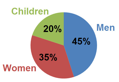
Above graph represents population of a Town divided into three parts i.e. Men, women and children

Such circular graphs are known as Pie Graphs . Pie Graphs are also known as Circle Graphs or Pie Chart

Such graphs show relationship between a whole and its parts or sectors and it is also used to show comparison of different parts or sector of a whole. The size of each part or sector is proportional to the activity or data its represents.

As shown in the above pie graph:
Whole part or circle represents the total population of a town. And three parts or sectors highlighted with blue, red and green represents percentages of men, women and children population.

Copyright@2022 Algebraden.com (Math, Algebra & Geometry tutorials for school and home education)